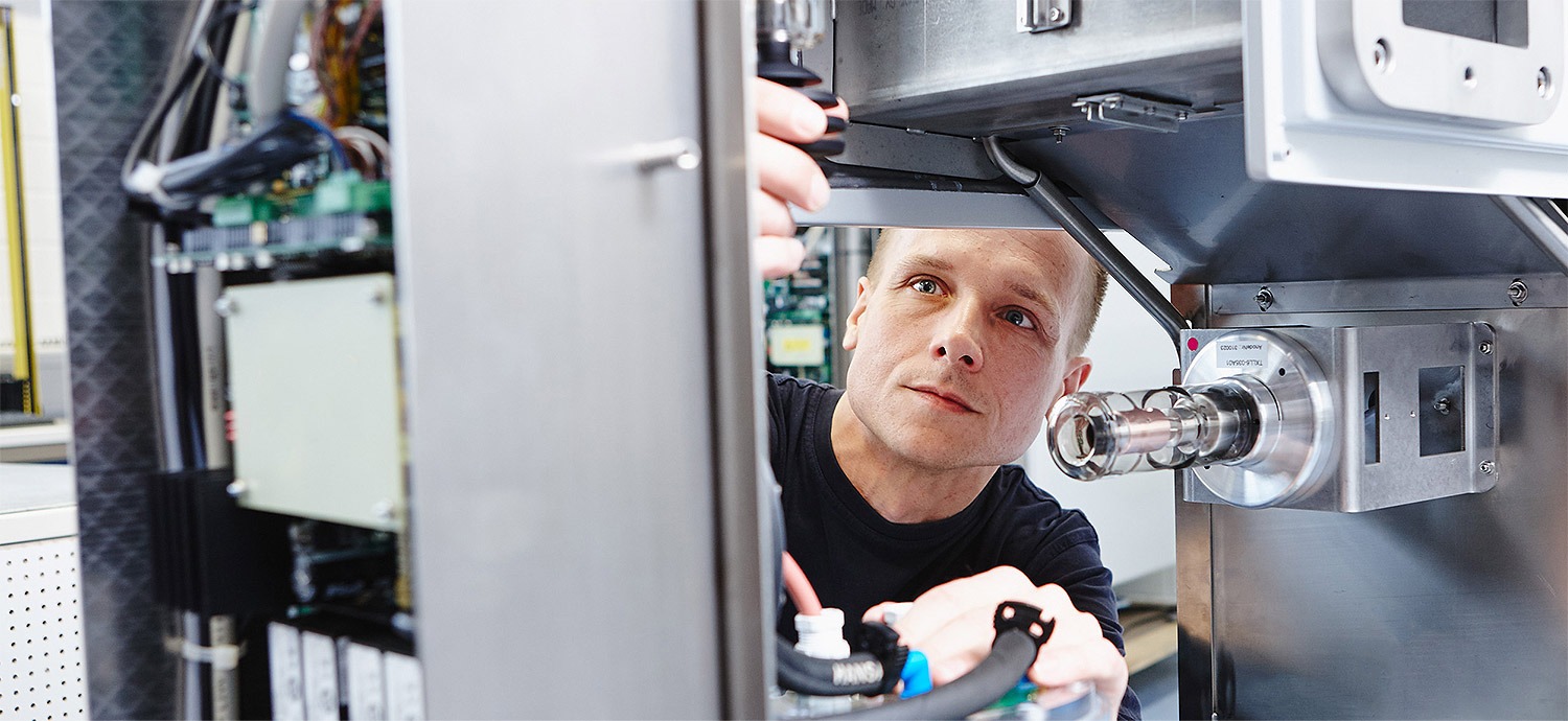
With the relaunch of the company website SIKORA presents itself in a new corporate design with a clear, intuitive structure, emotional pictures and the brand colors blue and white – starting mid-March.
Using an easy navigation, the new web presence guides the visitor to the desired pages. The changing topics with large, emotional pictures on the homepage inform about industries and news about the company. Via the menu item ‘Service’ the visitor finds an overview on all SIKORA services and is directly navigated to the new support and spare part request form. The section ‘Company’ offers customers, candidates and media representatives important and clearly structured information on SIKORA. SIKORA social media channels, providing a direct connection to social networks such as Twitter, are also integrated.
A further highlight of the new SIKORA web presence is the flexible layout. Whether PC, tablet or smartphone: the website design is responsive and adjusts automatically to every terminal and every display. Therefore, the functionality of the website remains at any situation and all information are fast, easy and user-friendly retrievable.
“With the relaunch of our website we present ourselves in a new design and at the same time modern, intuitive and emotional”, says Harry Prunk, member of the board at SIKORA. “Our users find their way around our page, independent of the device they are using.”


